

Bed Styling Ideas That Make Your Bedroom Look Expensive
By HomeStyledLiving | October 16, 2026
There is a particular kind of bed that stops you in the doorway. It is rarely the largest bed in the house, and it is almost never the most decorated one. It simply looks decided. The colours belong together, the fabrics have a visible texture, the pillows hold their shape, and nothing on the bed seems to be trying too hard. You couldn’t say what it cost, only that someone cared about every layer.
Most of us try to get there by adding. One more cushion, one more throw, a patterned set because it happened to be on sale. The result is usually a bed that looks busy rather than rich. Expensive-looking beds run on the opposite instinct: fewer decisions, made more carefully. One colour family instead of five. Real texture instead of shine. Pillows full enough to stand up on their own. A top layer large enough to drape properly instead of perching on the mattress.
This guide builds nine complete beds, each with its own palette, its own materials and its own attitude, from a crisp white hotel bed to a dark and moody charcoal one, from a low Japandi frame to a cloud-soft bouclé bed. Every look names the real pieces behind it, from the duvet cover to the frame, so you can recreate a whole bed or simply borrow the one decision that suits your room.
As you read, notice how the same few questions keep returning. What is the base colour? What is the surface texture? How large is the top layer? How full are the pillows? What frames the bed? Answer those well and a bed starts to look expensive, whatever it cost.
1. Build a Tonal Neutral Bed in Oatmeal, Sand and Ivory
 Save it
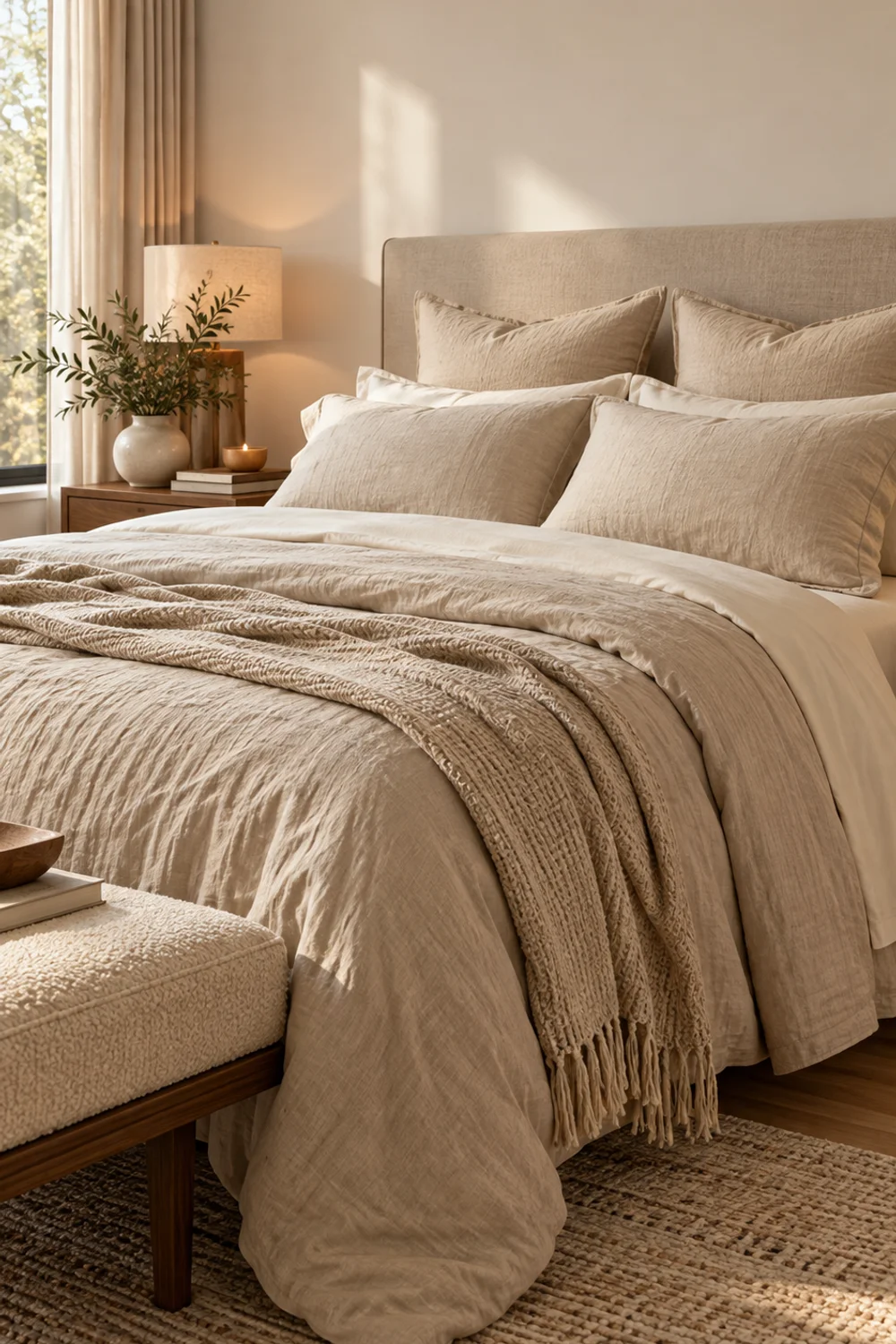
Tonal means one colour family played in three or four values, so the bed reads as a single calm shape instead of a collection of purchases. Oatmeal, sand and ivory are the easiest family to work with because they sit close enough together that nothing clashes, yet far enough apart that the bed keeps its depth. A matching set flattens everything into one value. Tonal layering lets light find edges: the darker duvet, the paler sheet showing at the fold, the pillow somewhere in between.
Start with the duvet cover, since it is the largest surface on the bed. This duvet cover is listed as 100% French flax linen in a natural linen tone, with a zipper closure and corner ties to hold the insert in place. Linen has a softly irregular surface that makes a bed look lived in, in the best way, and that relaxed texture is what stops a neutral palette from feeling like a showroom.
Choose sheets one value lighter. These sateen sheets in Ivory are described as a luminous, neutral ivory without creamy or yellow undertones, and the sateen weave gives a gentle sheen against the matte linen. Fold the top of the duvet back by a hand-width or two and the ivory shows as a thin, clean band, the sort of detail you notice on a well-made hotel bed without quite knowing why.
Euro shams do the structural work behind the sleeping pillows, adding height and giving the headboard wall a soft edge. The covers in Natural Beige are made from 70% ramie and 30% cotton with a flat flange edge, so they are natural fibres, though not linen despite the name. They are covers only, which means the insert matters as much as the cover. The Beckham Hotel Collection inserts are down alternative in a cotton cover, listed at a plush loft of around eight inches, and a full insert is what lets a Euro sham stand upright instead of slumping.
The thinking is the same one that Easy Small Bedroom Ideas That Make Any Room Feel Bigger applies to small rooms: when bedding and walls share a palette, the eye stops catching on edges and the whole room feels calmer. Keep the pillow list short here, two Euros and your sleeping pillows, and let the textures carry the look.
2. Dress a Crisp White Hotel Bed With Percale and Sateen
 Save it
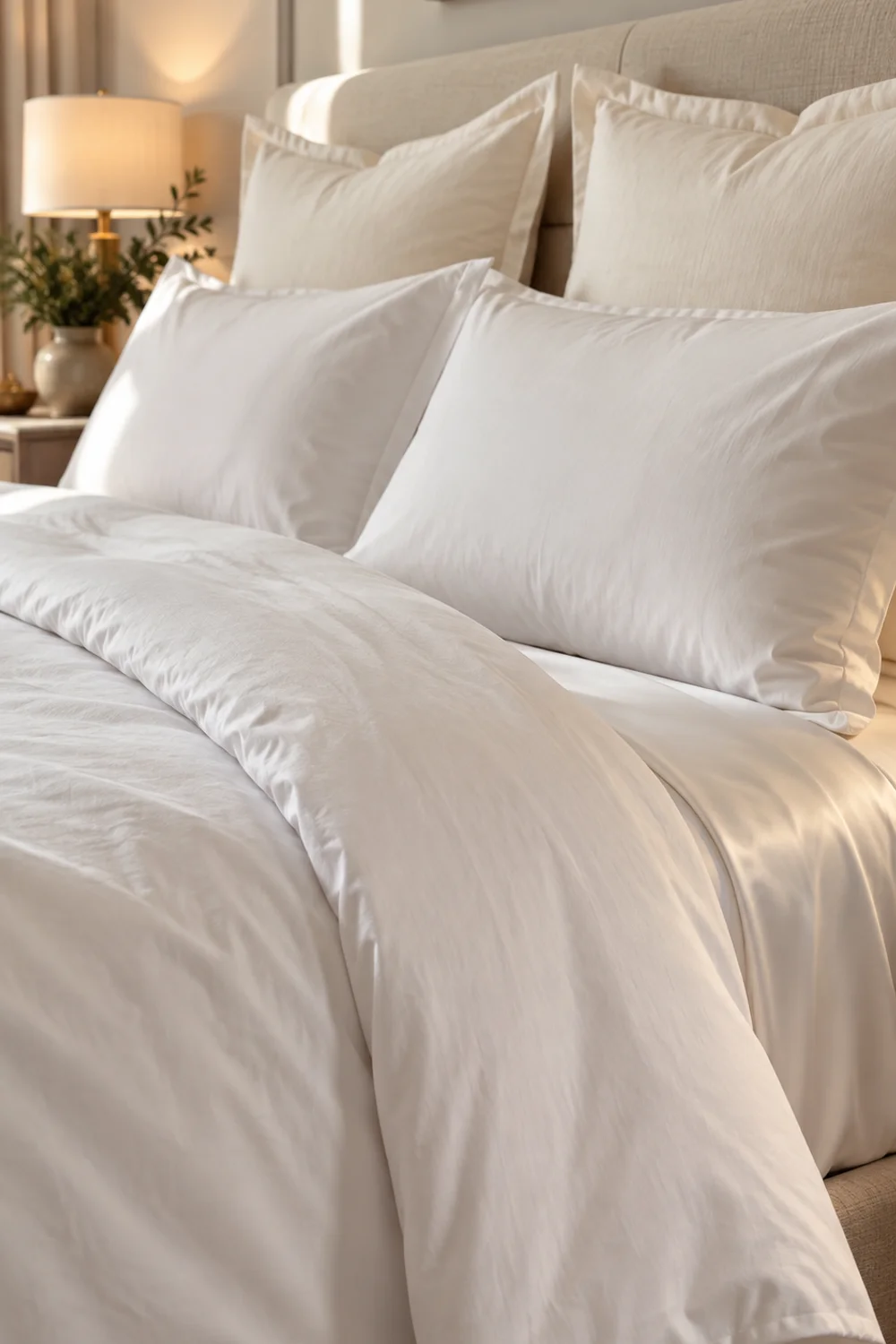
A white bed looks expensive when it has two textures, not one. All-white bedding in a single weave tends to look flat, or worse, clinical. The trick is to put a matte, crisp fabric next to a softly lustrous one, so the white seems to have dimension even though it has no colour.
For the matte layer, this duvet cover is organic cotton in a percale weave, which gives that light, papery crispness and a clean, dry drape. Percale doesn’t try to look soft. It looks sharp, and sharp is exactly what a white bed needs from its largest surface.
For the lustrous layer, these sheets are 400 thread count Egyptian cotton in a sateen weave, mercerized for a little extra luster, with a four-inch hem on the flat sheet and deep pockets on the fitted one. Turn the top sheet over the edge of the duvet and its sheen sits right beside the percale, which is where the contrast does its work.
Then comes a deliberate choice. Pure white pillows against pure white percale can look accidental, as if two sets almost matched. These covers are the confident move: a slightly warmer shade makes the white read as a decision. These covers in Cream White have the same flat flange edge as the Natural Beige pair, and they are covers only, so give them full 26-inch inserts.
The method is simple and worth doing every morning. Pull the sheet and duvet taut, fold the duvet cover back to a neat cuff about a third of the way down, set the Euros upright against the headboard wall and the sleeping pillows in front of them. Percale creases easily, so give it thirty seconds of smoothing with your hands before you add the pillows. That small ritual is what separates a crisp bed from a rumpled one.
3. Drape a Waffle Coverlet Over Natural Linen for Layered Taupe
 Save it
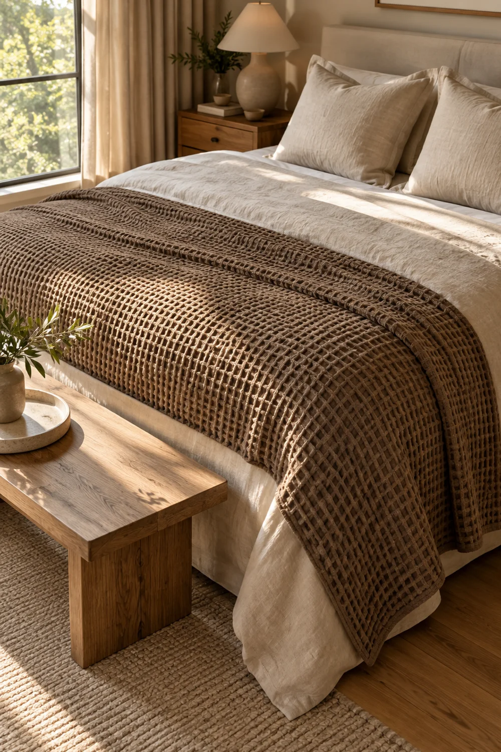
The easiest way to make a bed look fuller is to let the top layer hang. A coverlet that stops at the edge of the mattress looks like a placeholder. One that falls well past it looks tailored, and the extra fabric casts a soft shadow that gives the whole bed weight.
The waffle coverlet is 100% combed cotton, garment washed, in Truffle Taupe Brown, and the listing gives it as 92 by 96 inches with two matching shams. On a standard 60 by 80 inch queen mattress, that works out to roughly 16 inches of fabric on each side and at the foot when it is centred, enough to cover the edge of the mattress and reach down towards the frame. The waffle weave adds a pattern you feel as much as you see, and the deeper taupe gives the bed a visual anchor.
Place a lighter, smoother layer underneath so the coverlet has something to sit against. This duvet cover is 100% French flax linen, stonewashed, with coconut shell buttons and corner ties, in a natural linen tone. Folded back from the head of the bed, it shows as a pale band above the darker coverlet. That value contrast, light linen against deeper taupe, is what gives this look its layered depth.
At the head of the bed, the same Natural Beige covers from the first look work equally well here. Their warm, slightly irregular colour sits between the pale linen and the taupe coverlet, and that is the job of a middle tone: it joins the other two without drawing attention to itself.
Fold the coverlet into a loose band across the lower third of the bed rather than spreading it flat. Folded this way, the waffle texture shows its depth, the linen remains visible above it, and the bed gains the layered, put-together silhouette that flat bedding never has. If the folded edge ever looks too neat, give it one soft push and let it fall naturally.
4. Go Dark and Moody With Charcoal Bedding and Cream Contrast
 Save it
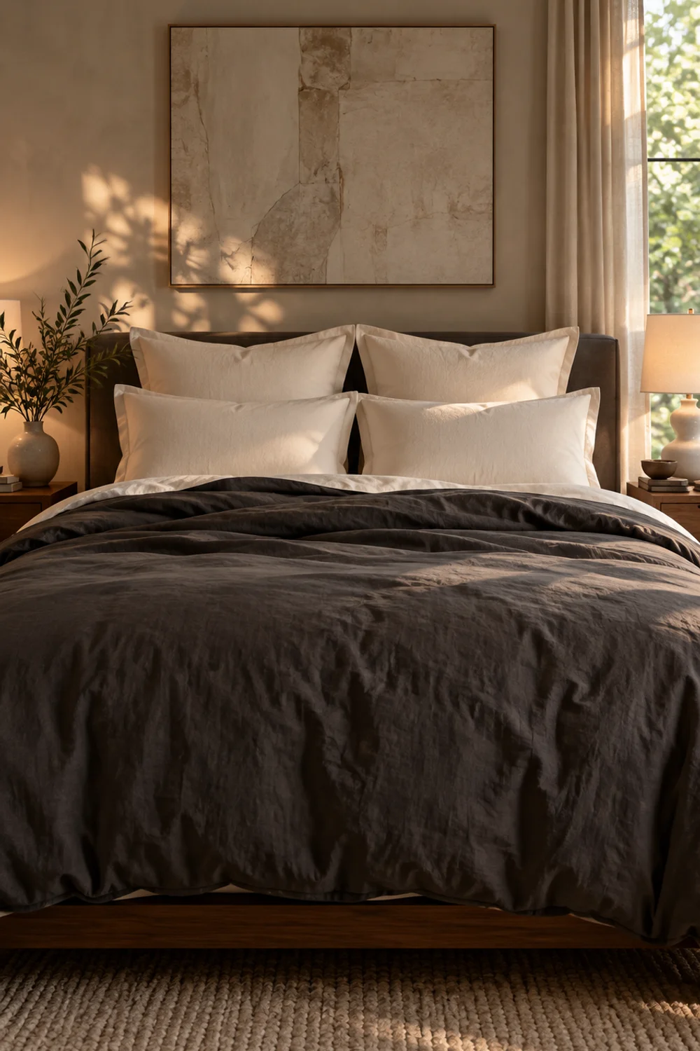
A dark bed can look more expensive than a light one, provided it has a light edge to push against. A single deep colour across the largest surface reads as a confident, quiet shape, and the pale details around it, pillowcases, sheets, shams, give the eye places to rest. The look belongs in rooms with a little daylight or warm light, where the charcoal can show its softness rather than disappear.
This duvet cover in Dark Grey is 100% washed cotton with a slightly wrinkled, linen-like texture, a hidden zipper and eight ties inside to keep the insert from shifting. The washed finish matters: it breaks up the colour so the grey reads as fabric instead of a flat block.
The contrast comes from ivory sateen. Use these sheets in Ivory for the pillowcases and the cuffed edge of the top sheet, and leave the dark grey pillowcases that came with the duvet set in a drawer. A pale pillowcase against the charcoal field is the cleanest way to give a dark bed a sense of light.
Two covers in Cream White rise behind the sleeping pillows. Against charcoal they look warmer and softer than they would against a pale bed, which is exactly the effect you want: the cream picks up the warm tone of the room’s light and sets a gentle boundary at the head of the bed.
A few practical notes keep the look sharp. Dark fabric shows lint and pet hair more than light fabric does, so a quick pass with a lint roller is part of making the bed. Wash dark and pale pieces separately so the colours stay clean. And keep the rest of the bed quiet. A charcoal duvet with ivory and cream is already a complete scheme; adding a third colour would only dilute it.
5. Bring In Depth With a Rich Olive Bed
 Save it
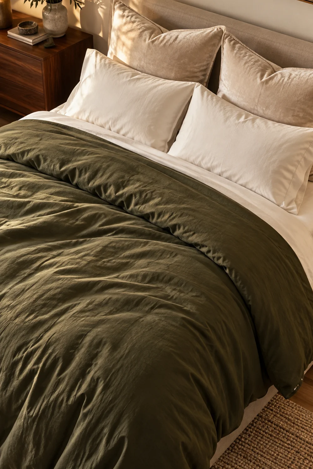
Olive sits at the point where colour starts behaving like a neutral. It is deep and muted, with enough warmth to feel natural and enough weight to anchor a room, and it pairs with ivory and cream without the stark contrast of black or navy. For a bedroom that needs more personality than beige can offer, it is one of the safest ways to use real colour.
A duvet cover in Olive Green is 100% washed cotton in a solid olive, with the same softly wrinkled finish as the dark grey version. That finish is the quiet reason olive works here: a flat, shiny green can look synthetic, while washed cotton lets the colour move between shades in the light.
Underneath, sheets in Ivory are 100% cotton percale, crisp and matte in the hotel style. Because olive already carries colour, the sheets should stay plain and light. Folding the top sheet over the edge of the duvet gives you a fine ivory border that sharpens the shape of the bed.
This look is the right place for velvet. These covers in Cream White have a double-brushed surface, and the nap catches light differently from the washed cotton beneath it. That small shift in surface, matte against soft sheen, is what makes the pillows look expensive. Fill them with full 26-inch inserts so the velvet keeps a clean, square outline.
Check the colour in your own light before committing. Olive can lean green in daylight and brown under warm lamps, and a swatch against your wall will tell you more than a product photo. Keep the palette to olive, ivory and cream, and let any wood in the room, a nightstand or a headboard, supply the warmth.
6. Style a Classic Navy and White Bed
 Save it
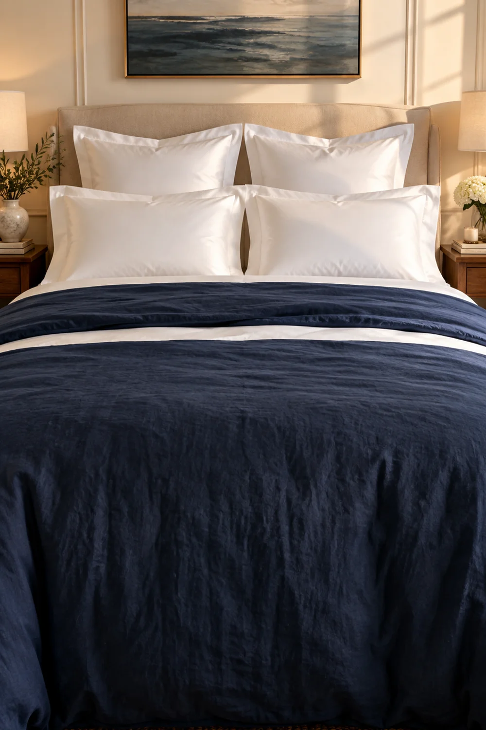
Navy and white is a formal pairing, and formality is what makes it look costly. The contrast is high enough to give the bed crisp edges, yet navy is soft enough to avoid the starkness of black. Think of it as a tailored jacket for the bed: structured, balanced, and a little traditional in the best sense.
A duvet cover is 100% washed cotton in Solid Navy, with a relaxed lived-in texture, a hidden zipper and eight corner ties. The washing gives navy a soft, slightly faded depth rather than a stiff, uniform dark, which keeps the look quiet rather than nautical.
Against it, white should be crisp and clean. These sheets are 100% GOTS organic cotton in a percale weave, woven at 160 thread count for a light, airy hand. Percale’s matte finish keeps the white from competing with the navy, and the sheet turned over the top of the duvet gives the bed a bright, ruler-straight line.
For the pillows, choose sheen. The white covers are 100% Egyptian cotton, 600 thread count, in a sateen weave with a subtle luster. Beside the matte navy they catch the light and brighten the head of the bed, and their smooth surface looks tidier than a textured cover would. Set them upright and symmetrical, one at each side, with sleeping pillows in front.
Symmetry is part of what makes this look work, so resist the urge to scatter. Navy and white reward discipline: a straight fold, a centred pillow arrangement, and nothing extra. Wash the navy separately from your whites so dye and lint never travel, and smooth the white percale before the pillows go on.
It also helps to watch the bed across a whole day. In morning light the navy looks soft and slightly faded, and by evening it deepens towards ink. That shift is part of the charm, and it is a good reason to keep every other element on the bed plain: the colour is already doing the talking.
7. Add Glow With a Velvet Bed in Champagne and Taupe
 Save it
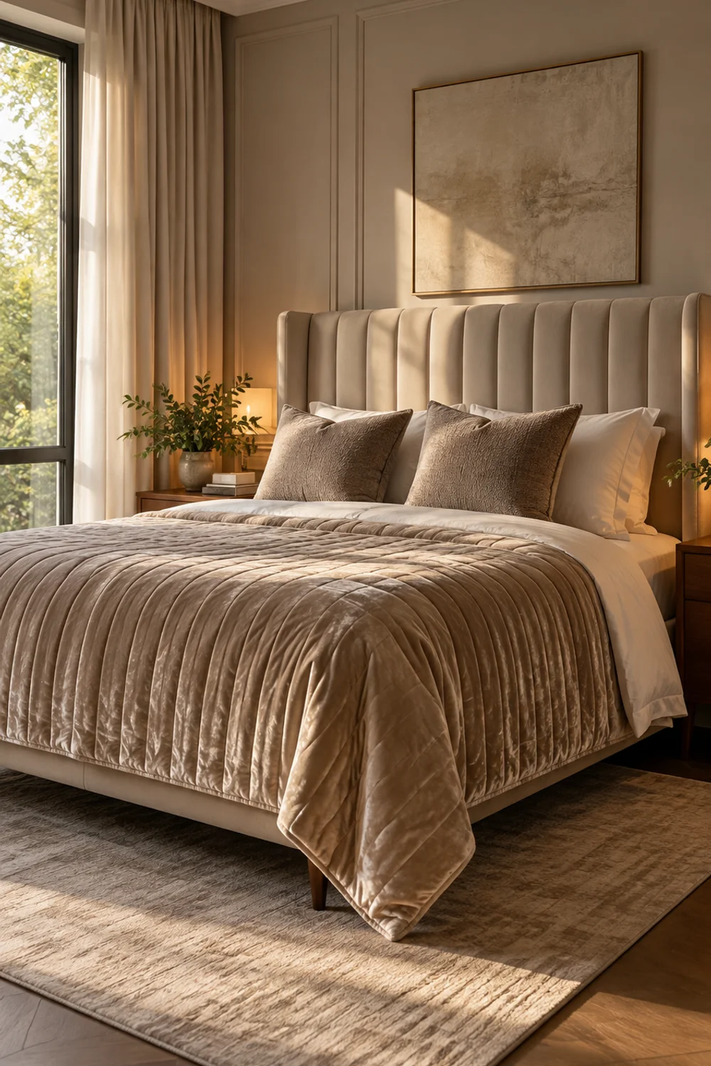
Sheen is the quickest visual shorthand for richness. Velvet moves with light; as you walk past the bed, its surface shifts from deep to pale, and that constant subtle change reads as luxury. The challenge is restraint. One velvet surface is glamorous. Three start to look like a theatre set.
A velvet quilt set in Beige Taupe has channel stitching, a soft shimmer and a lightweight down-alternative fill, listed at 92 by 96 inches with two matching shams. Because the colour is a warm, grown-up taupe rather than a bright jewel tone, the velvet feels refined instead of loud. Use it as the main layer and let it fall over the sides.
Underneath, choose something smooth and quiet. The 600 thread count sheets in True Ivory are 100% cotton sateen, and their soft sheen suits velvet without competing with it. Let them show along the turned-back edge and on the pillowcases.
To keep the look from becoming too shiny, introduce one matte nap. These covers in Taupe, 20 by 20 inches, are heavy and soft rather than glossy, and they sit in front of the sleeping pillows to break up the velvet’s sheen with a calmer surface. Two of them are plenty.
The frame completes the picture. This queen platform bed has a tall wingback headboard with vertical channel stitching in beige velvet, set on tapered solid wood legs; the listing gives its overall size as about 82.7 inches long, 60.2 inches wide and 51.7 inches high. A tall, upholstered headboard frames the whole composition, and the vertical channels echo the stitching on the quilt. Velvet shows pressure marks, so brush it flat with your hand when you make the bed, and keep the rest of the room’s fabrics matte.
8. Keep It Low, Natural and Quiet With a Japandi Bed
 Save it
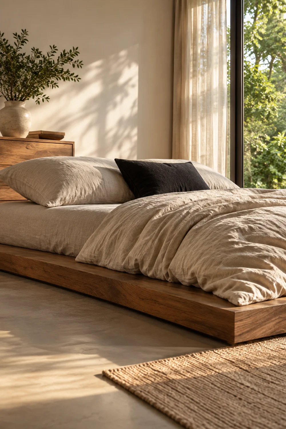
Where the velvet bed adds, the Japandi bed subtracts. It looks expensive because of what it leaves out: no headboard, no pile of cushions, no competing colours. What remains is wood, linen and a lot of space, and the space is the luxury. A low bed lowers the room’s horizon, which makes the walls feel taller and the whole room calmer.
The frame is the starting point. The platform bed is a low, floor-standing wood frame without a headboard, listed at about 81 inches long, 61.4 inches wide and only 7.7 inches high. Sitting that close to the floor, the bed becomes a quiet plinth rather than a piece of furniture asking for attention.
Let linen do the rest. These duvet cover is listed as 100% French flax linen in a natural tone with a zipper closure, and its soft, lived-in creases belong in this look; Japandi bedding isn’t meant to be pressed. These sheets, also French flax linen in Natural Linen, keep the surface consistent, so the bed reads as one material rather than a mix.
Keep the pillows to two sleeping pillows, and skip decorative ones altogether. The restraint is the point. If you want a single accent, make it dark and plain, one charcoal cushion, never a pattern.
Let the room support the bed in the same spirit. Warm white walls, one piece of wooden furniture and a window that is lightly dressed all send the same message: nothing here is competing for attention, so everything that is here looks chosen. A look this simple only works when the surroundings are as calm as the bed.
Be honest about the trade-offs. A low frame leaves no room beneath for storage, and it asks more of your knees when you get in and out. Linen wrinkles by design, so this is not the bed for anyone who wants a perfectly pressed surface. But if calm is the goal, few looks deliver it as reliably.
9. Layer Bouclé and Chunky Textures for a Cloud-Soft Cream Bed
 Save it
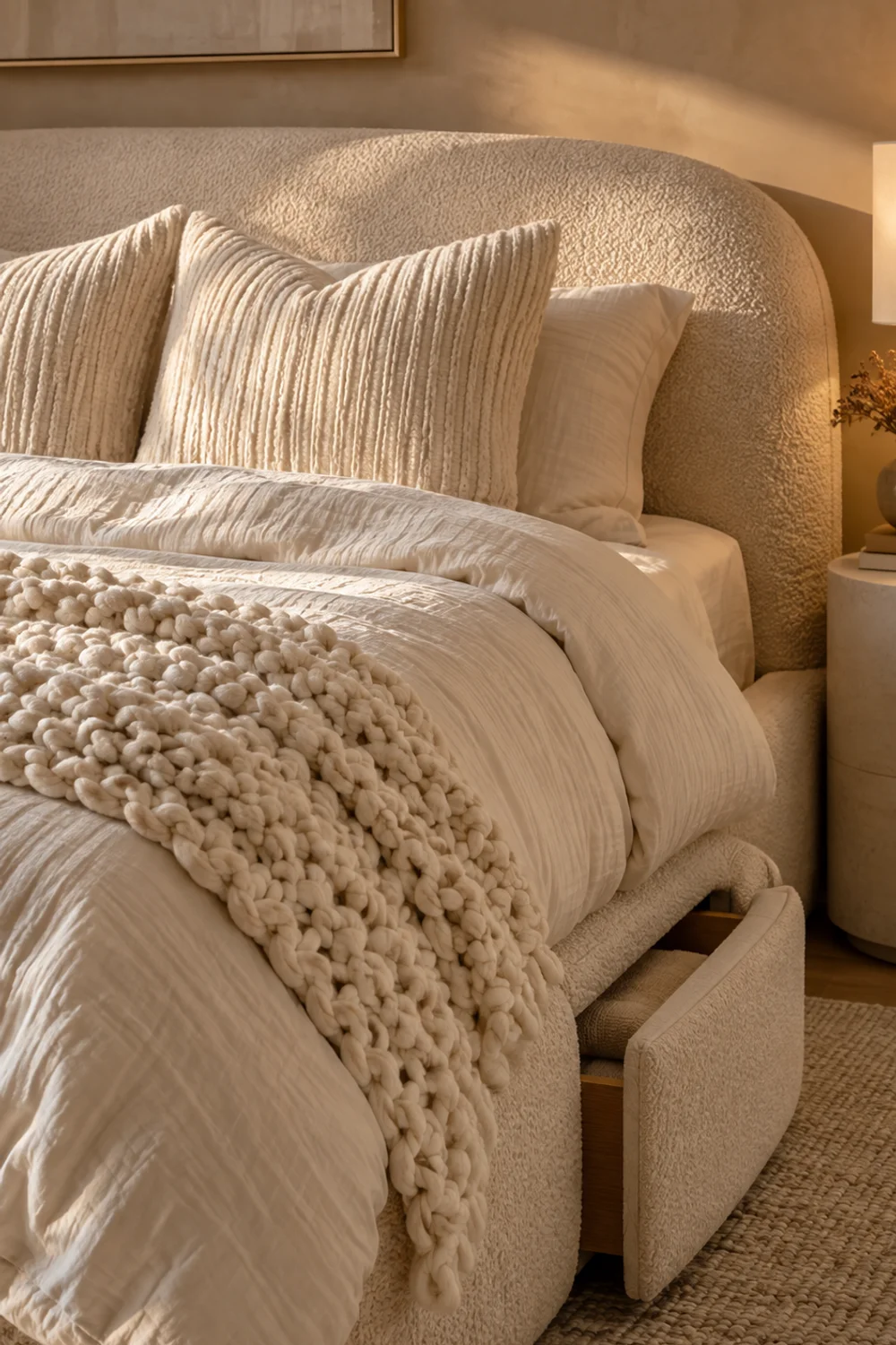
When colour is kept to a single cream, texture has to do all the talking. This bed uses four distinct surfaces in one shade: bouclé, muslin, slubby chenille and a rope-knot throw. Each catches light differently, and together they create a soft, sculptural depth that photographs beautifully and feels even better in person. It is the bed that looks like a cloud.
The frame sets the tone. It is a queen platform bed upholstered in thick bouclé, in Beige, with an adjustable-height headboard that fits 10 to 12 inch mattresses and two storage drawers that can be placed in different positions underneath; the listing gives it as about 82.5 inches long, 61.8 inches wide and 42.9 inches high. The rounded, nubbly fabric gives the bed a built-in softness before any bedding has been added.
A duvet cover is 100% muslin cotton in Cream White, with a light, naturally crinkled surface, a hidden zipper and eight corner ties. Muslin brings an airy, crinkled quality that sits well against thicker bouclé: it softens the look, so the bed feels relaxed rather than heavy.
At the headboard, the covers are heavyweight chenille with a slubby weave, in Cream White, covers only. Their slightly uneven surface adds the third texture and gives the pillows a tactile, upholstered look. Fill them with full inserts so the chenille drapes with weight rather than collapsing.
The final layer is a thick throw. A chunky knit is a hand-woven cream chenille rope-knot throw at 50 by 60 inches, weighing about 3.5 pounds, and draped diagonally across the foot of the bed it adds the heaviest, most sculptural texture of all.
With this much fabric on a bed, the question is where it all goes at night. A single open basket by the bed solves it, and Small Bedroom Organization Ideas That Instantly Free Up Space shows how a blanket basket at the foot of the bed can give throws and extra pillows a place to live. Chunky knits can snag, so keep jewellery and rough zippers away from the throw, and keep it to one per bed.
Common Mistakes
1. Buying everything from one matching set
A full set in a single fabric and shade is convenient, but it flattens the bed into one value and one texture. Expensive-looking beds mix two or three surfaces in one colour family, such as matte linen with sateen sheets, or percale with a waffle coverlet. Buy the pieces for their own jobs and let them coordinate in colour rather than in a pattern.
2. Piling on too many decorative pillows
Six or seven cushions can make a bed look busy and make it harder to make. Pillows are most convincing when each has a clear role: Euros for height, sleeping pillows for use, and perhaps one accent for texture. If you cannot say what a pillow is for, it is probably one pillow too many.
3. Choosing Euro covers without full inserts
A beautiful cover over a limp insert slumps against the headboard and looks tired by lunchtime. The cover sets the look, but the insert gives it its shape. Match the insert to the cover size, and choose a full fill so the pillow stands up on its own.
4. Letting undertones clash by accident
Warm cream next to cold white can look deliberate or careless depending on whether you meant it. If you’re mixing undertones, do it on purpose, with a clear contrast, and keep the rest of the palette consistent. When in doubt, stay within one family.
5. Ignoring the finish
A well-chosen bed can look cheap if it is wrinkled, sagging or unevenly tucked. Smooth the sheets, pull the duvet straight, brush velvet flat and fold the coverlet into an even band. The thirty seconds you spend finishing the bed are worth more than another purchase.
Frequently Asked Questions
How many pillows should a bed have?
It depends on the look you’re after. A bed with two Euro pillows, two sleeping pillows and perhaps one accent looks full without feeling crowded, while a minimal Japandi bed may need only two sleeping pillows. The more pillows you add, the more each one needs a clear job.
Do I need Euro pillows to make a bed look expensive?
Not necessarily, but they help. Large, square pillows against the headboard add height and give the bed a more structured silhouette. If you skip them, make sure the sleeping pillows are full enough to stand upright and fill the space behind them.
What colour makes a bed look the most expensive?
There is no single colour, but there is a pattern: a restrained palette in one family, whether that’s warm neutrals, crisp white or one deep colour with cream. Expensive-looking beds rarely use more than two or three shades, and they get their interest from texture.
Is linen or cotton better for a luxurious look?
Both can work. Linen has a relaxed, textured look that suits natural, lived-in styles, while cotton percale or sateen gives a crisper, more polished surface. The most convincing beds often combine two fabrics, such as a linen duvet cover with sateen sheets.
Do I need a headboard to style a bed well?
No. A headboard frames the bed and makes it look more finished, but a low frame without one can look just as considered, as in the Japandi look above. If you add one, choose a shape and fabric that echoes the bedding rather than competing with it.
Final Thoughts
An expensive-looking bed is rarely about spending more. It is about choosing a colour family and sticking to it, letting texture do the work that pattern usually does, giving the top layer enough size to drape, and filling the pillows so they hold their shape. Whether you lean towards soft neutrals, crisp white, a deep olive or a dark charcoal, the same few decisions are what make the difference.
You don’t have to copy a whole bed. Pick the look that fits your room, then borrow whichever single idea feels easiest: a lighter sheet showing at the fold, a waffle coverlet draped across the foot, or Euro pillows with proper inserts. If the budget is tight, spend first where the eye lands: the duvet cover and the pillows define a bed’s colour and its shape, while sheets, throws and a frame can follow in time. Start there, make the bed with care every morning, and the room will start to feel more finished almost at once.
This post contains affiliate links. I may earn a small commission at no extra cost to you. As an Amazon Associate I earn from qualifying purchases.

GET YOUR FREE CHECKLIST
A More Organized Home
Starts Here
Join the community and my free Home Organization Checklist, plus weekly tops and inspiration.
Thank you!
You have successfully joined our subscriber list.